Weekly Projects Semester One
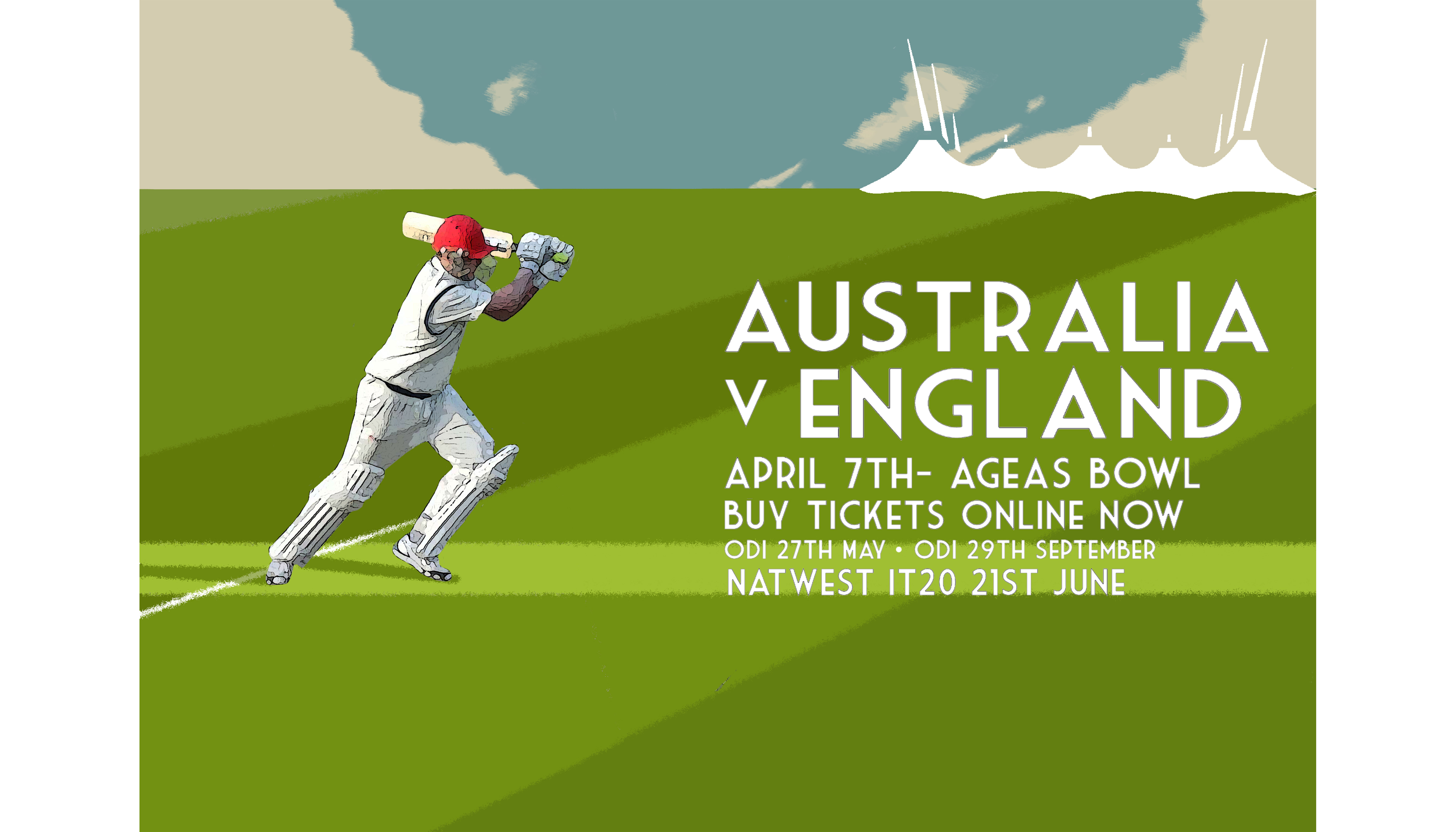
Composition Poster
In week 2 we looked into the different types of composition and layouts that make an outcome better. Our task was to create a ficticious sports poster using the golden curve or rule of thirds.
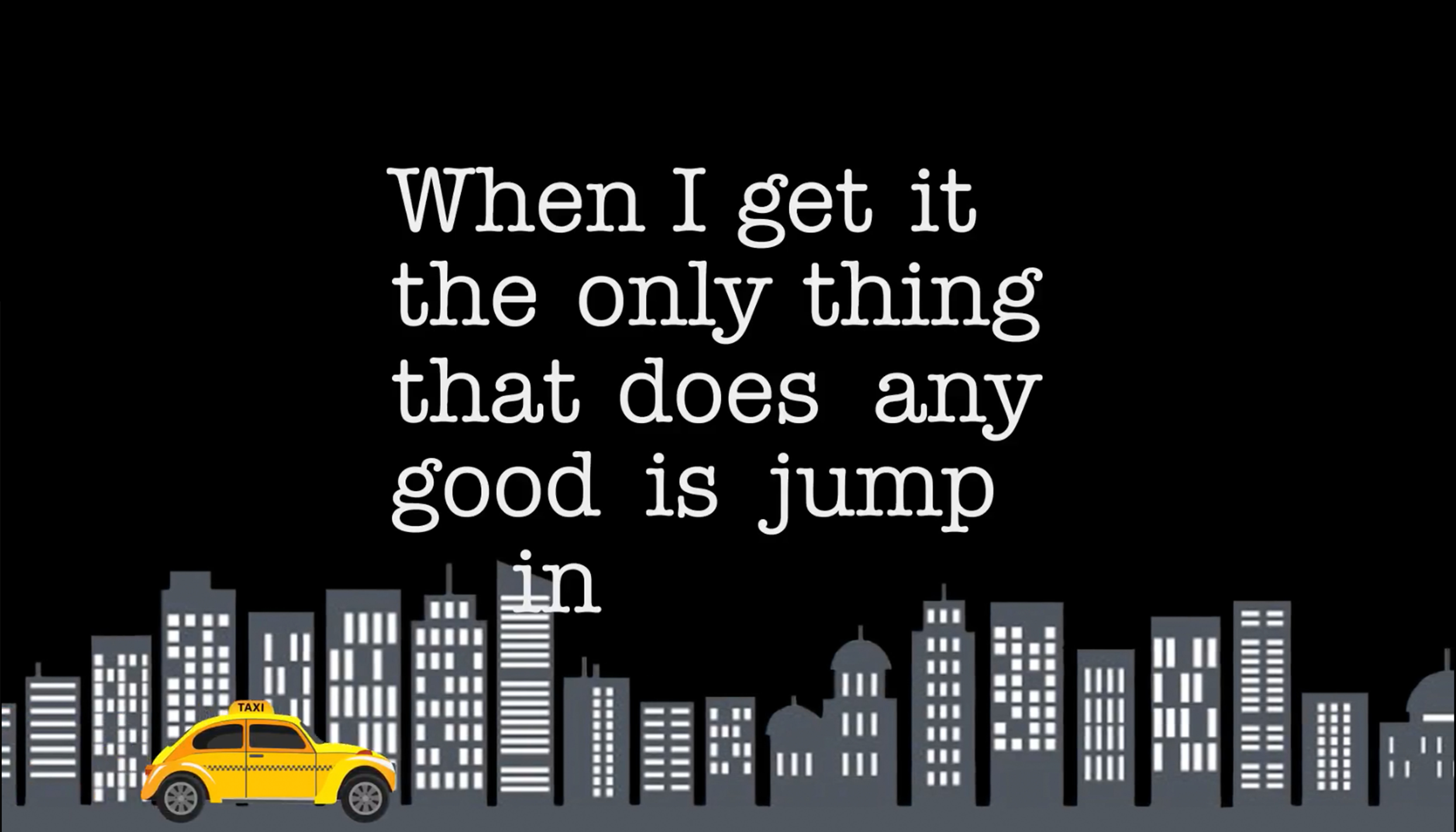
Kinetic Typography
In week 3 our task was to create a kinetic typography video. We looked at some examples and how typography is used to create a mood and a tone. Click to view video.
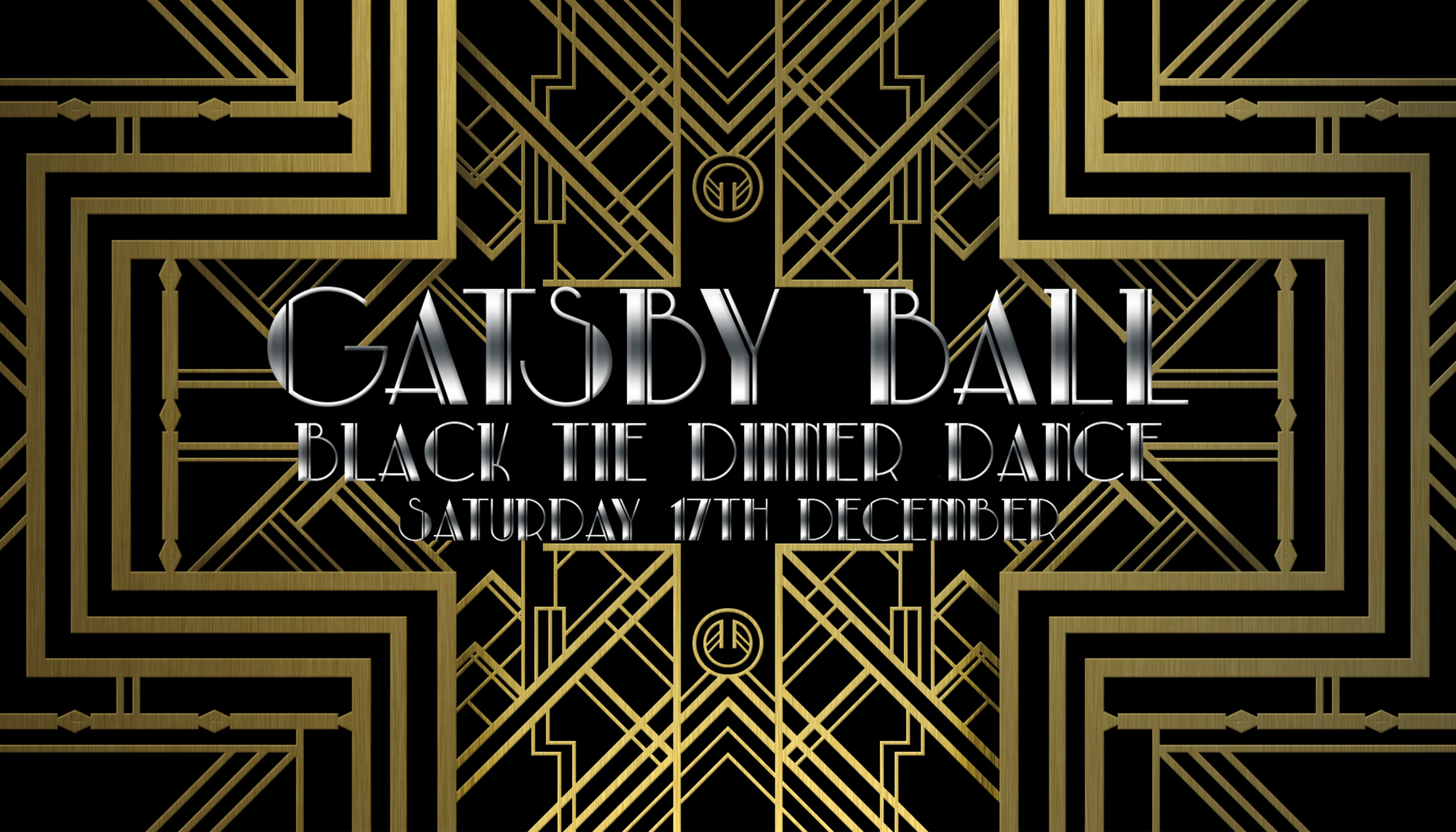
Colour Poster
In week 4 we studied colour and the different conotations they have and what it can symbolise. I created a poster using colours that signify the event.
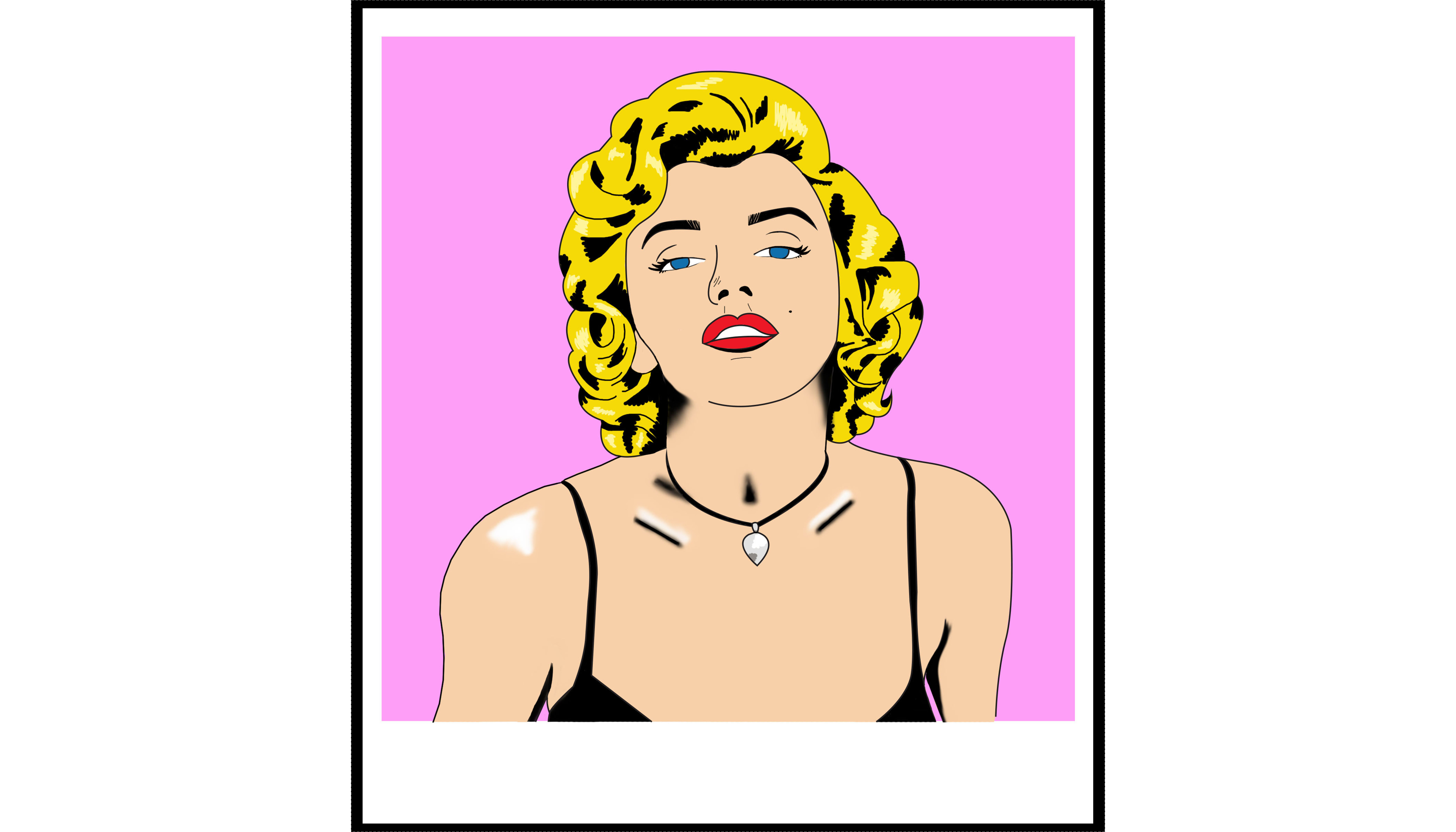
Digital Art
Week 5 we researched different types of Art movement and well known artists. I looked at Roy Lichtenstein and Pop Art, recreating an image of Marilyn Monroe working in his style.
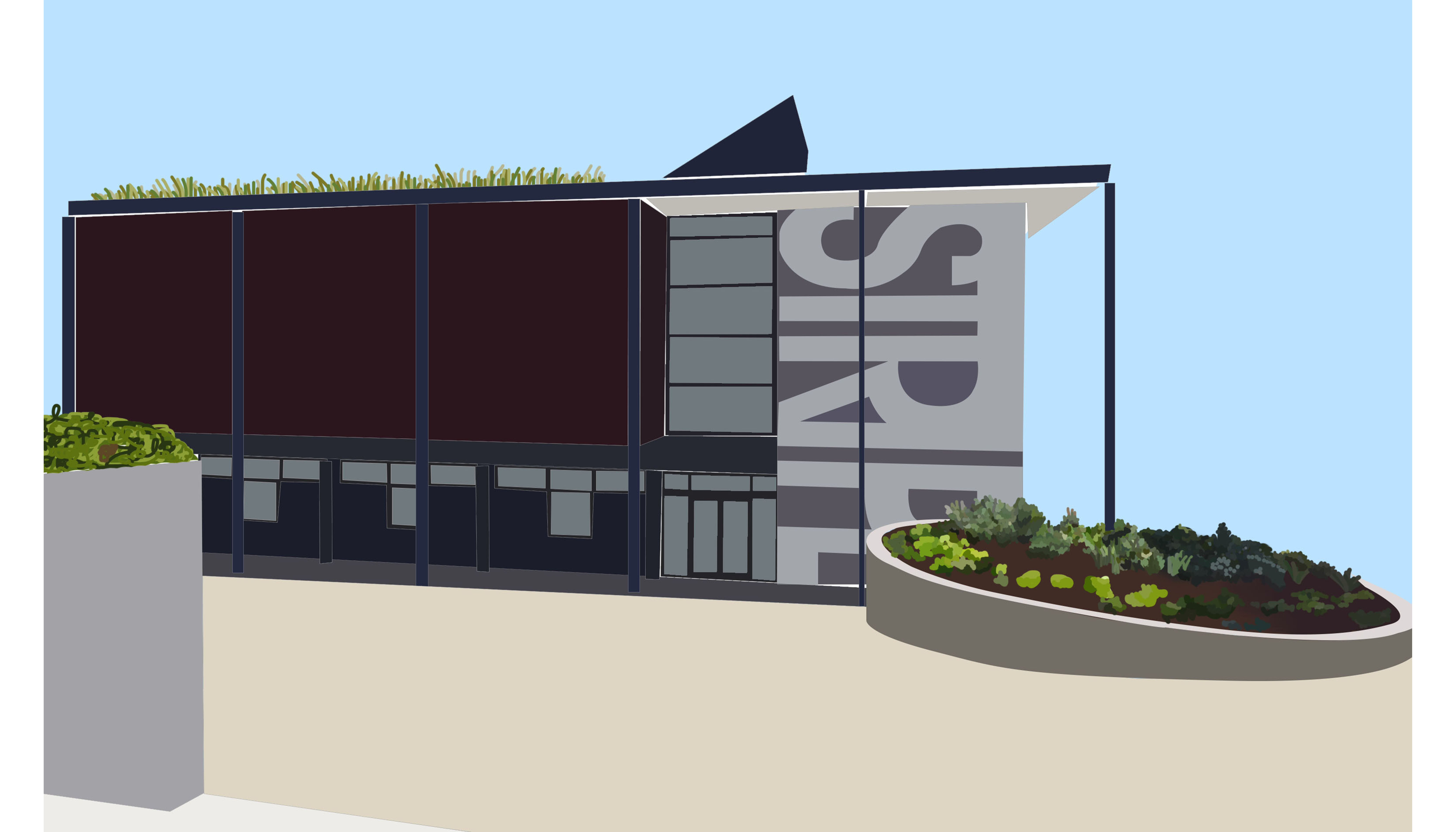
Campus Illustration
For week 6 we took our iPads outside to create sketches of the campus as live drawings. I then chose to develop a few into coloured outcomes and improve them. Click to see more.
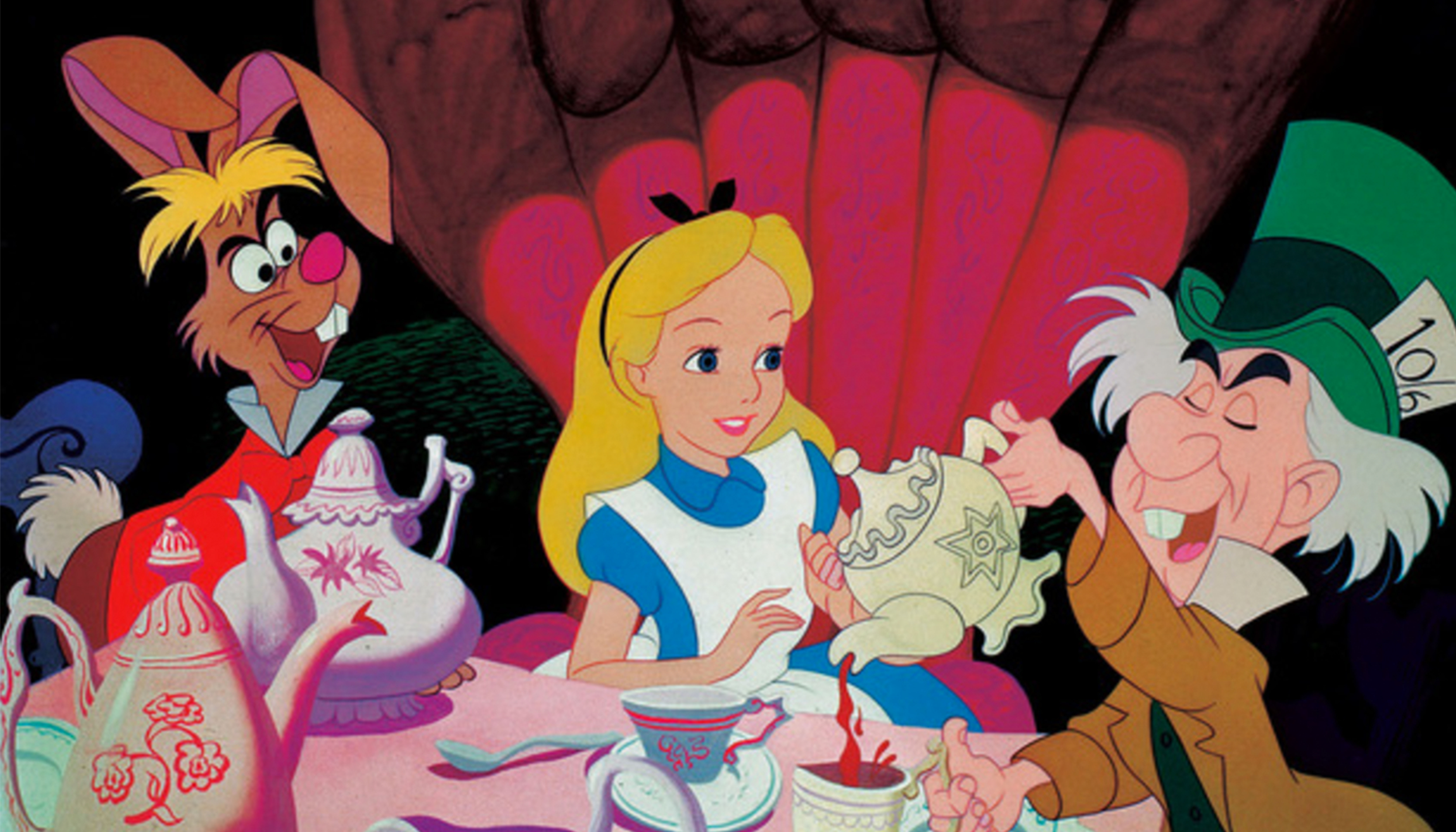
ISTD Project
From week 7 to week 9 our task was to look into the ISTD project and come up with some ideas for an outcome following the brief that we could potentially continue with. Click to see more.
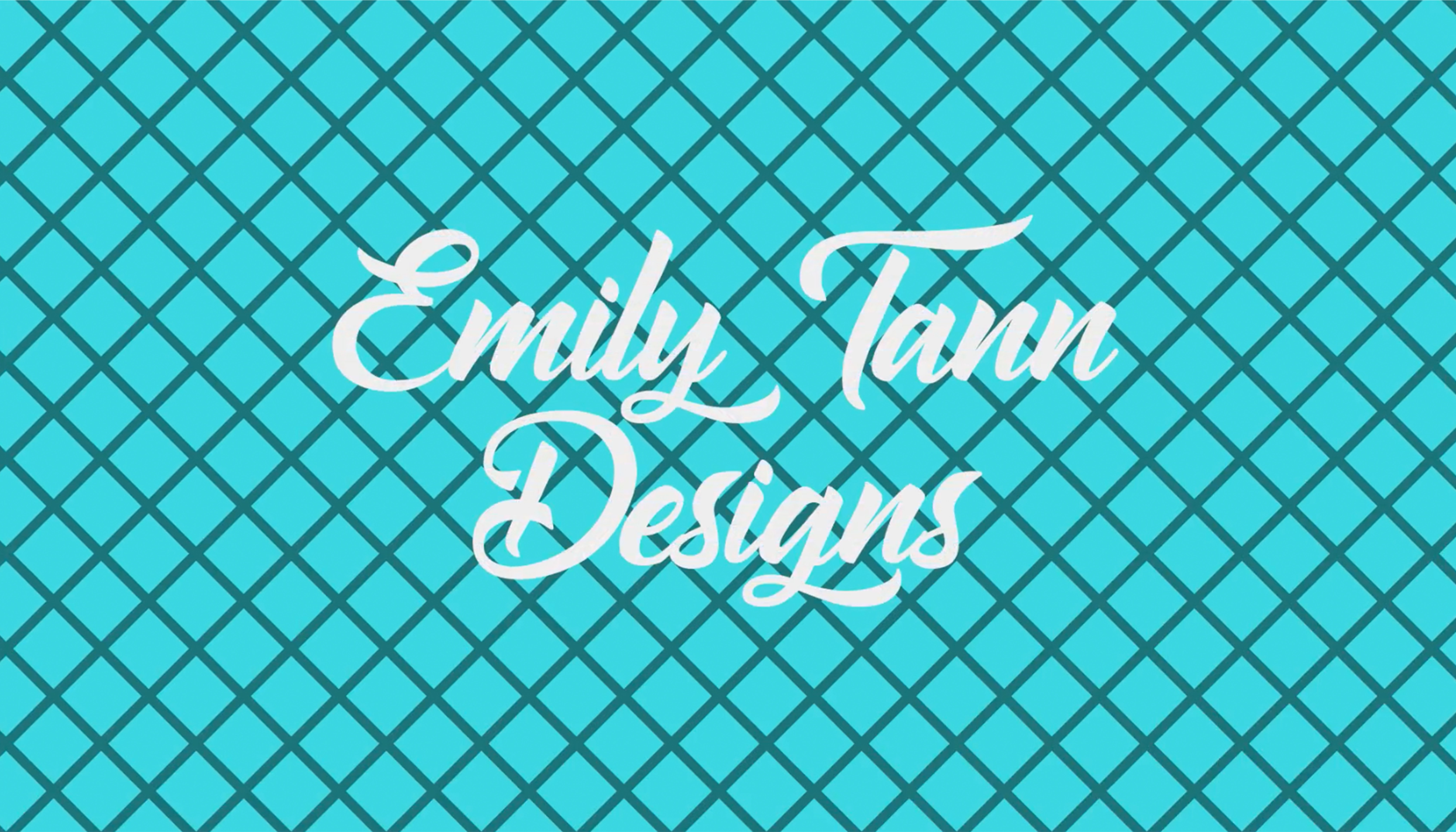
Animated Logo
Weeks 10 and 11 were studying animation mainly using after effects, our task was to design a logo for ourselves and animate it. Click to view video.