Inital Research For Character Animation
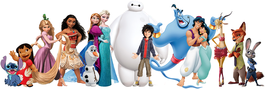
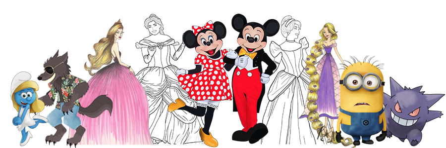
Disney
Disney are known as the top dogs of the animation world producing immense character sensations. Even though, these characters are all designed under disney, they still have various art styles that are highly interesting. What is really great to look at is the concept art for some of these characters, seeing how the designer bought them to life is really facinating.
Disney Princesses for example have very exaggerated features such as their eyes, hair and small waists. They made to look very dainty and elegant, the exception is Moana. Compared to the others she has a much stonger build and more visibile muscle, that being said she is the more recent "princess".
Big eyes are a signature Disney Character look and this goes for Disney Pixar too *see below* animal characters are given human features but are still very distinguishable as the animal. The way they create animals to humans is worth noting- they're realistic but still very obviously a disney character.
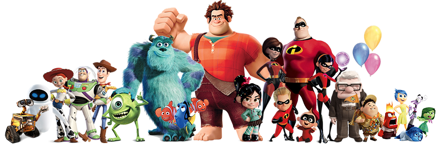
Disney Pixar
Disney Animation and Disney Pixar do swap and change designers so its likely to see similarities between the two. In my opinion Pixar are more cartoon like features and qualities have been exaggerated. For example Ralph's hands or Mr INcredible's muscles.
Colour and blending technique is exacly the same as Disney and is a very sought after art style in animation world, realistic without pushing into photo-realism. Colours are very vibrant which pulls the animation together considering some of the storylines.
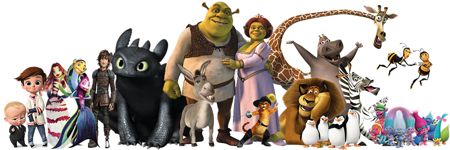
Dreamworks
Dreamworks, just like Disney, have designed some of the most popular animated characters in the world. The animal characters are far more realistic than how Disney portray them, the madagascar characters follow the animals body and just have more of a humans facial features on. The same is for Donkey and Puss in Boots from Shrek. Shark Tale characters are a bit more human like, elongating fins to look like limbs and hair, the bees from Bee Movie have got bigger heads and longer arms and legs, but it doesnt stop you knowing its a bee.
The coolours Dreamworks designers use, are more muted colours which in my opinion gives the characters a more photo-realistic look. This doesnt apply to the Boss Baby characters which are almost identical to how Disney and Disney Pixar create characters. Trolls are the only charcaters in the above picture that have a brigther more cartoon like colour scheme.
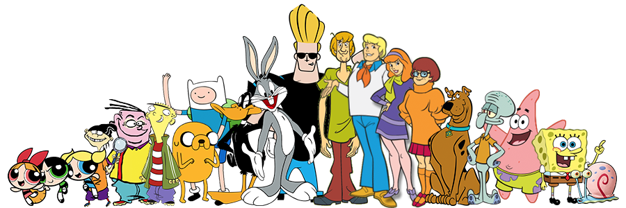
Cartoon Network
Cartoon Network is a more basic design of character animation but still very well known for their characters. They are more cartoon than previous animators. They use muted block colours, no blending or creting shadow or light it is very simple. Some characters are more proportionate than others, Scooby Doo characters follow the basic outline of a human and nothing is out of proportion. Ed, Edd and Eddy on the other hand are completly cartoon style.
The cartoon characteristics of the powerpuff girls is iconic and still something people use as inspiration. Spongebob is my favourite though, the creativity to characterise a sponge in a shirt and tie is very clever and his friends squidward with tentacles and a long nose and Patrick Star the starfish wearing swimming shorts is something stuck in most peoples memories.
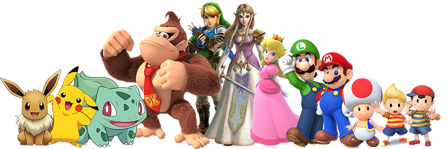
Nintendo
Pokemon are their own company but used by nintendo. They use limited colour adding shading and highlight for effect. Mario on the other hand is human and looks like one but with disproportionate features, peach is very proportionate and that suggests her character is considered perfect. Colours are smooth and blended Zelda is different from the others. The character is a lot more realistic, the proportions are correct and the a use of muted colours. There’s a lot more detail here
All Nintendo characters have developedo over the years as games have got more and more advanced, they advance with it. Adding more of a colour range, blending techniques, refining their characters and adding more detail.
My Work
So this is some of my previous work from school, college and outside projects. I've included this to see where my strengths lie. Using existing characters copying their exact style with digital art and blending colour, but also live tracing on illustrator and adding colour myself. I also like to hand draw things first as it’s something I believe I’m good at. I alos like the finish of the princesse, this is in a fashion illustration style. I dont think this would be a style I go forward with for my character design.
I want to work to my strengths when creating my character, my plan is to hand draw a few ideas and build on it creating the original concept art. Then scanning it in and live tracing in Illustrator and adding and blending colour in Photoshop.
Brief
In this workshop we learnt about the fundamentals of 3D modelling, shading, texturing and lighting in 3D modelling programme, or a vector based 2D programme as well as 3D printing. Our brief was to produce a stylised 2D or 3D character; including all the stages of character production, from its design to creating a rigged model, ready to animate. Creating an animaton of our character.