Branding For Cherry Childcare
Typography
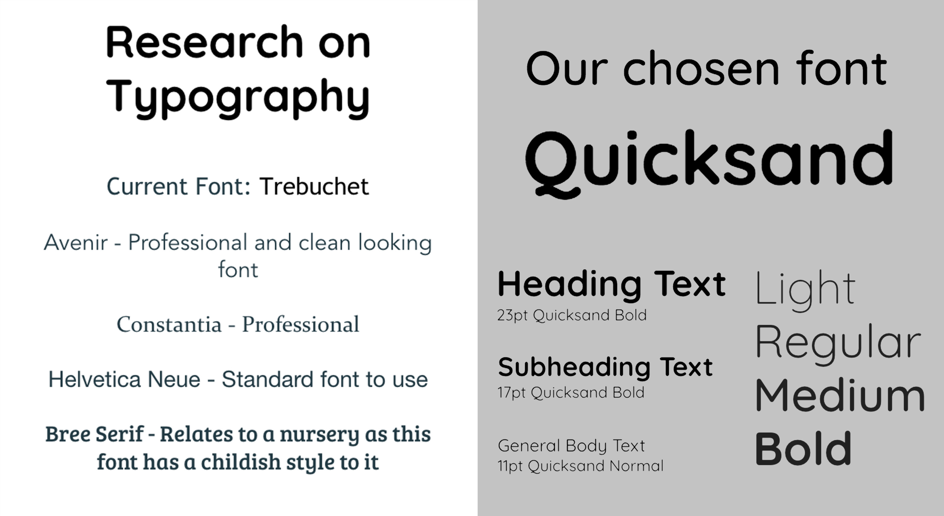
To start of the creating the branding guidelines we looked into changing the font, their current font was Trebuchet. Which in my opinion was to basic and gave the site an old look. We needed a font that would complement the current branding.
Looking at other nursery websites and what fonts they use is useful to see what works well. we were after a font that is clean and professional without making the text look boring. It also needs to be nursery appropriate to cohere to the theme of the site.
We chose the font ‘Quicksand’ the rounded edges gives it a friendly feel while being appropriate to use on a website for a children’s nursery. It’s also a clear and professional looking font that it won’t make the website look too childish. When paired with the Cherry Childcare logo, the most important factor as the client wanted to keep their logo.
Colour
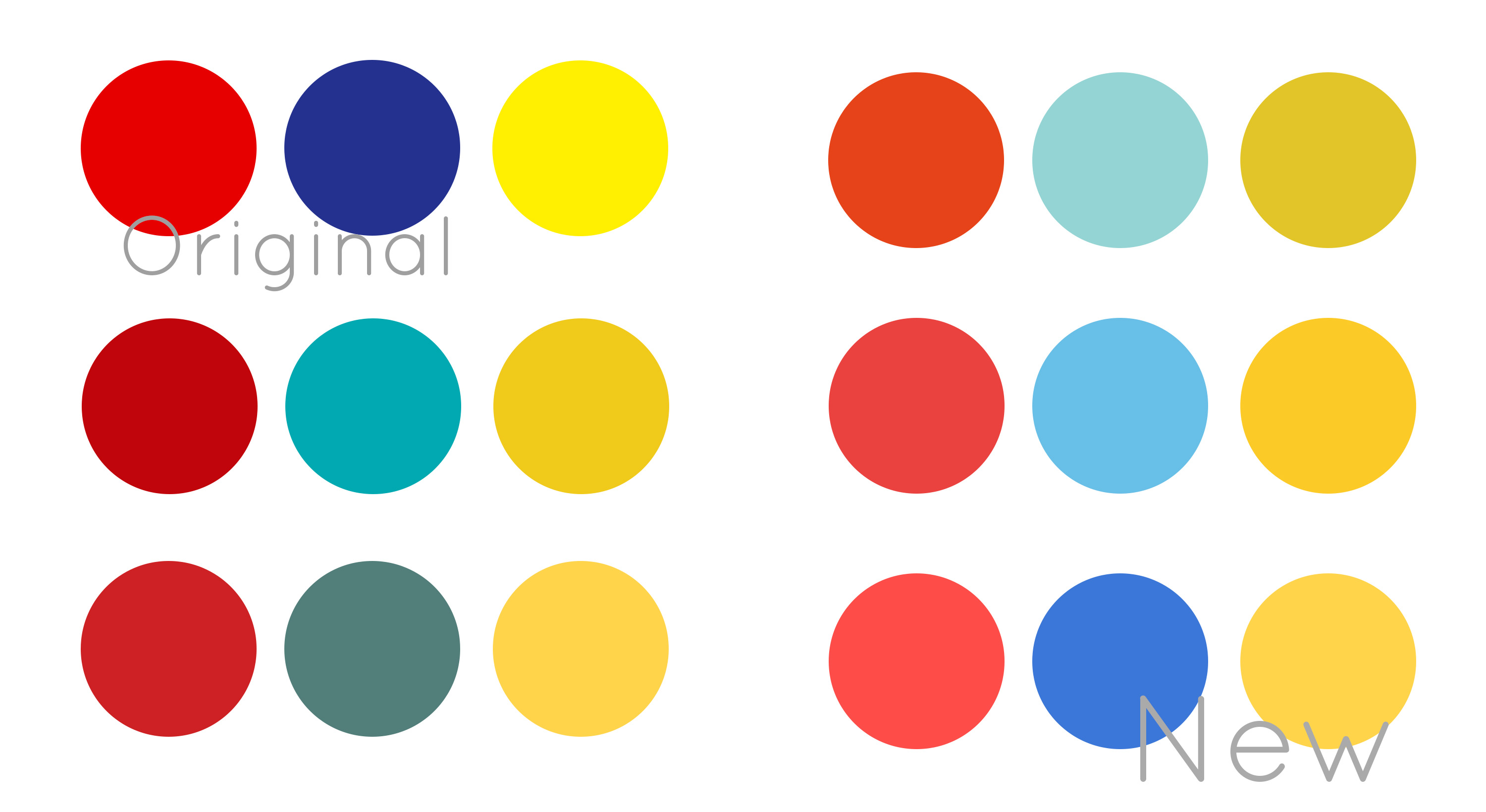
Moving onto colour guidelines the current website uses the three primary colours, blue, red and yellow. The colours they used were very bright and make the website look a little dated. So we asked the client if we were okay to experiment with colours, they wanted to keep the colours as that what the nurseries use within the building, but we had permission to play around with the shades and toning them down.
We started working with muting the original colours, seeing what works together ad would work throughout the website. One issue was their current colour scheme wasn’t entirely consistent on the website. So we looked at the placement of the colours, where we’d want them and then what would work best.
These are some of the colour combinations we tried out, and eventually got our end result. They work well together, are still vibrant, just as the client had before. However they are much softer and toned down, it will give the website a more modern look while still having a friendly feel.
Logo
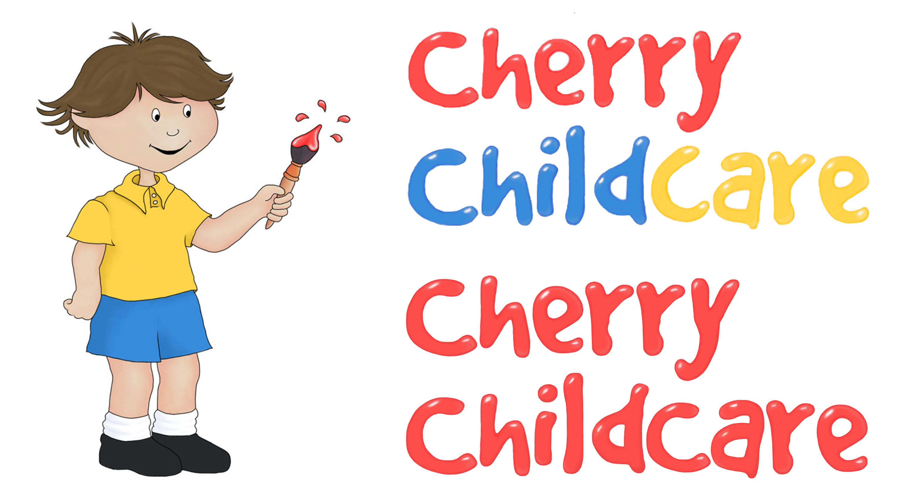
The client wanted to keep their logo, as changing it entirely would mean rebranding all their uniforms and nurseries. But they were happy for us to update it, using the new colour scheme and making it look a little more current. I looked at the font of the logo adding our new colour palette, experimenting with having all three colours or just the one.
I kept the exact shape of the original logo, using photoshop I used the brush tool to add the new colours where applicable. I also smoothed out the logo, updating the style of it. I have changed the boys hair colour as in their current website this gets lost quite easily being such a light colour. Rather than it having a patchy textures in their colours I’ve blended this out, adding shade and highlight. This gives the logo a bit more depth and will now look more up to date with the rest of the website.
Leaflets
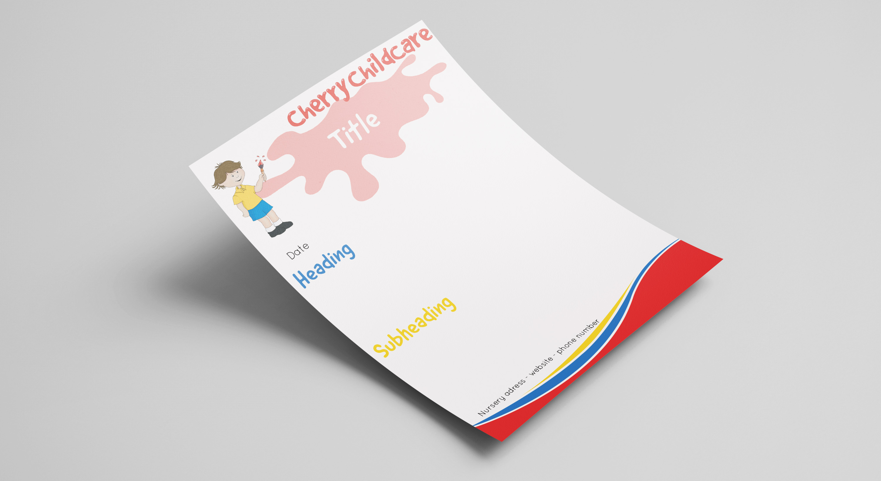
One of the things needed on the website was a database for all the nursery’s admin and leaflets and letters for the parents. With the rebranding design the client asked if we could create a leaflet/ letter template.
I made this very simple and nothing too child-friendly as paperwork is mainly for the adults. That being said it still needs to follow the branding throughout the website. I’ve included the logo with a paint splatter next the boy where the title will be. I’ve used the same font as the logo for the title and subheadings, leaving space for the content which is set to be in the quicksand font.
The client really liked this, I’ve handed over the original InDesign file, showing him how you change the title and mix the colours round; and idea I had for the different topics of letters to have corresponding colours. And a copy that can just be used in the background and written over.
Brief
The client wanted us to create a new website that has a modern look, is appealing to their demographic audience and also reflects their culture and ethos. Working as teams alongside developers we needed to research competitors, update branding and design and create a new website with an online database.