Competitors Research For Cherry Childcare
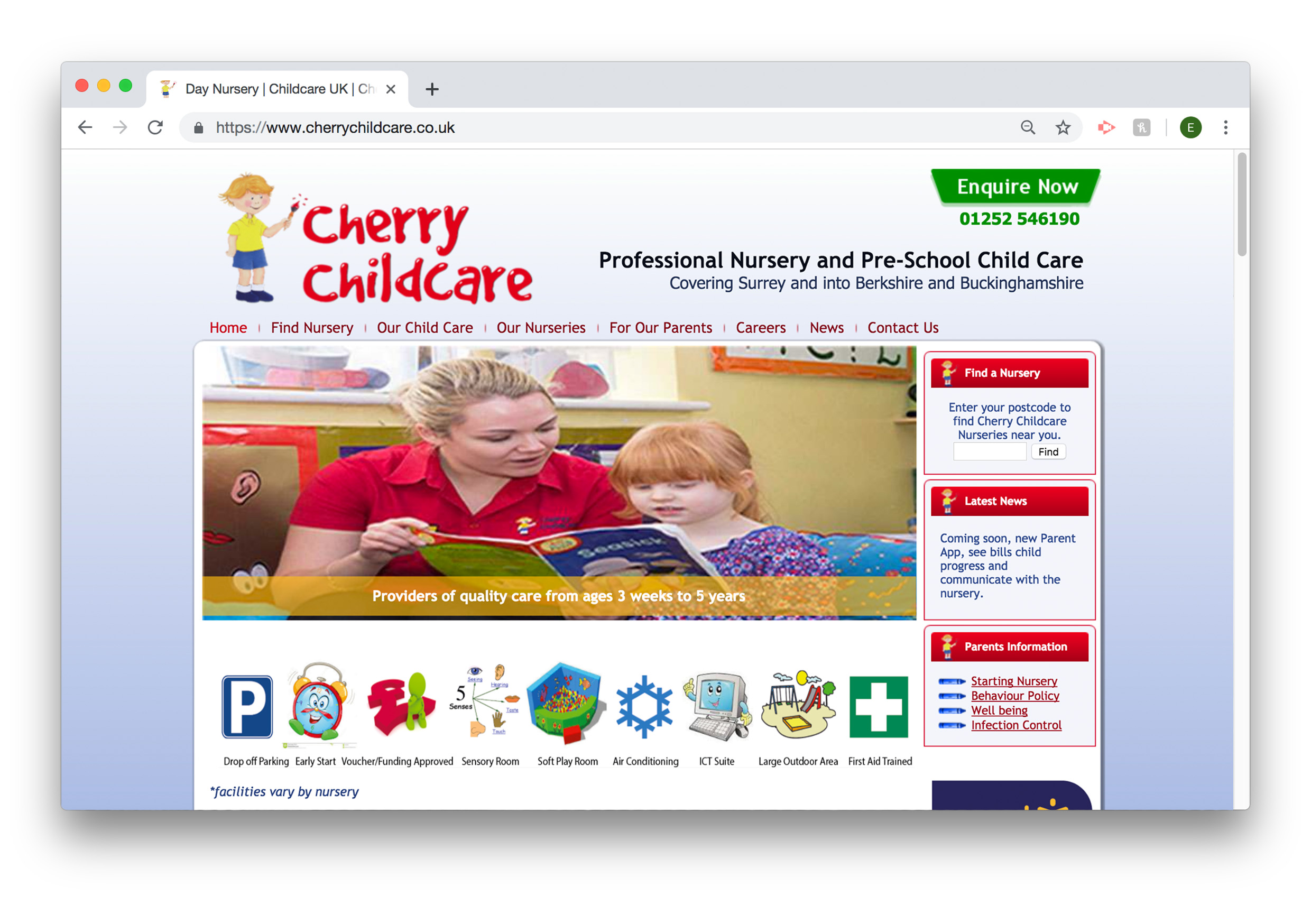
Cherry's Original Website
Once we had chosen our groups and our client we could hear a bit more about the brief. In this meeting my group wanted to get as much from the brief as possible, to really understand what they wanted us to produce. The client knew their website was outdated and not easy for users to navigate round. They wanted a more modern site still keeping everything on there, and having ease of use. Their idea was a website that was in the running with their competitors, which started us off with a few ideas.
Looking at the clients current website, other than it being really outdated, we noticed the colour scheme wasn’t exactly complimentary. There was little consistency throughout the website and not very easy to navigate round.
There were massive chunks of information all in one area then only a few words elsewhere leaving the rest of the page blank. Font was also mismatched and pictures were stretched and out of proportion.
This was their first ever website and it had never been updated, so for that reason it isn’t all that bad. Their branding had a good start, it just needing building on. Their use of icons was pleasing and makes the site a little more user friendly. Their enquire now form is consistent and at the top of every page; something the client was adamant on having when we were developing the new site.
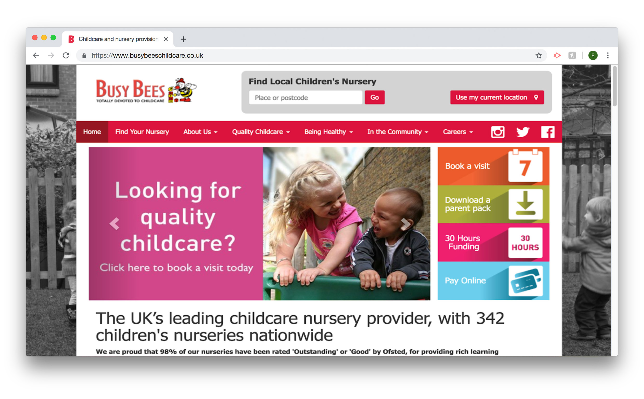
Busy Bees Childcare
This is the first competitor that we looked at. Looking at what works for the website we note that it has a consistent theme through its website on desktop and mobile. It’s very easy to navigate around finding what you need quite quickly.
“Find your local nursey” is at the top of every page an instant call to action drawing potential clients in. They have a very eye catching statement “The UK’s leading Childcare Nursery” draws the user in to read more, enticing them to use the key buttons like ”Book a Visit”. Clicking for further action already.
Looking at what doesn’t work for the webpage is the responsiveness and how it looks on a mobile. The mobile one because a very long scrolling page, the images get lost and it starts to look very block heavy. This mean the reader would lose concentration, not looking at the content. It’s very cluttered and not easy to navigate round, lots of things such as social media links and buttons to pages get lost when you switch to mobile.
Looking at this compititor we can take what works for them and list what we what to include on our website.
-Not too cluttered
-Clear headings
-Images shown through slide show
-Links to social media
-Search bar on main page
-Highlight all Outstanding OFSTED through the years
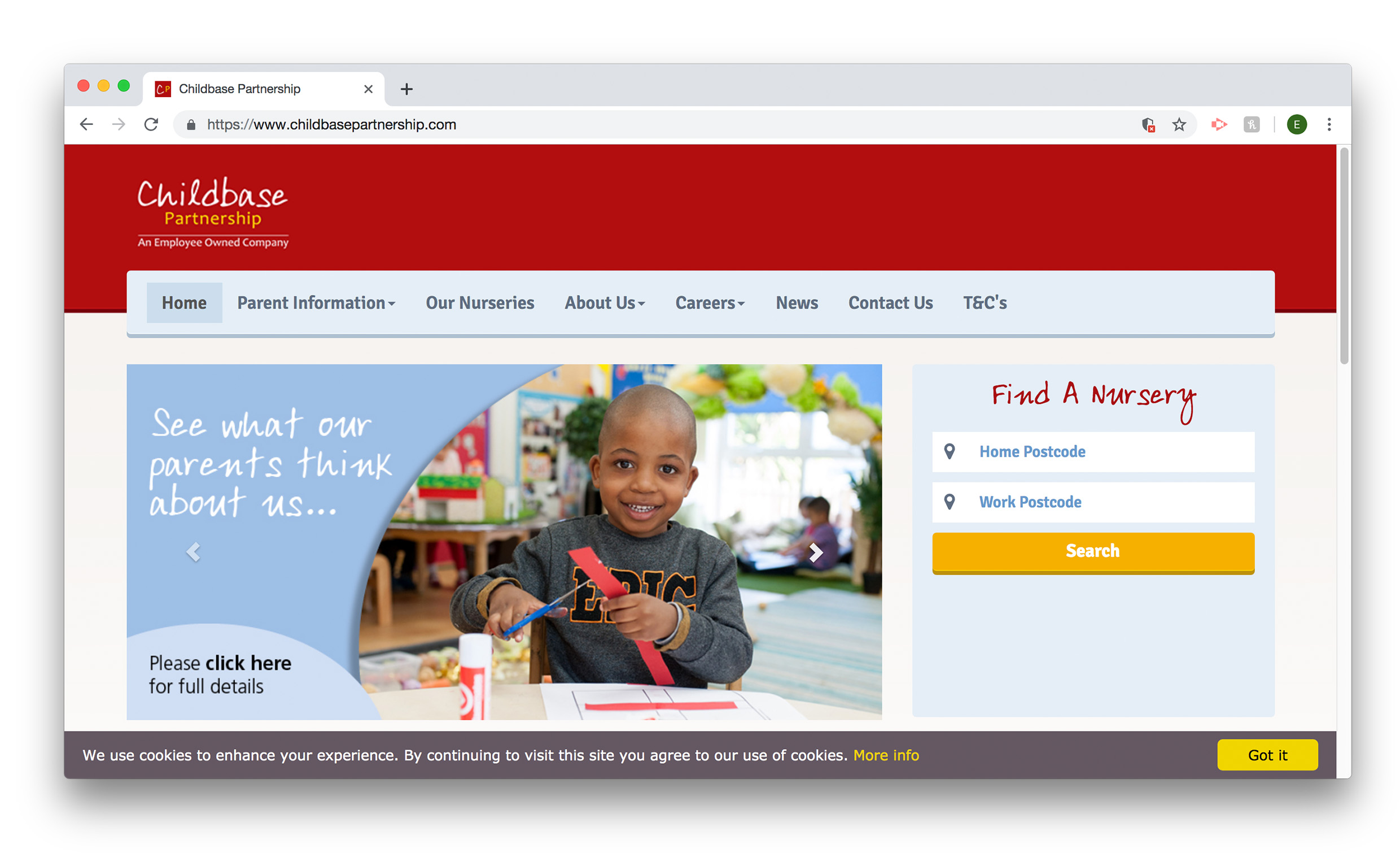
Childbase Partnership
Their next competitor is Childbase Partnership. They have a different style of website and looks more updated than the last, a very clean and professional layout with illustrations aimed towards children. All key information is available on the homepage making it easily accessible. A nice touch is that the site showcases their awards and testimonials; clients like to see feedback, reasons why they should send their child there, they shouldn’t have to look for them.
The site runs throughout their desktop and mobile versions consistently, keeping colours, pictures and information all in the correct place. They have a similar “find your nursery” search tool as Busy Bees.
Aside from the child friendly illustrations there isn’t a great deal of visuals on the site and very little of actual nursery life. The website becomes quite boring once you get past the homepage. Pages get more and more text heavy as you go through, losing the users interest.
What we take from this competitor would be:
-Professional look
-Rounded text creates friendly feel
-Friendly characters which appeal to children
-Simplistic
-Clear Layout
-Clear colour scheme
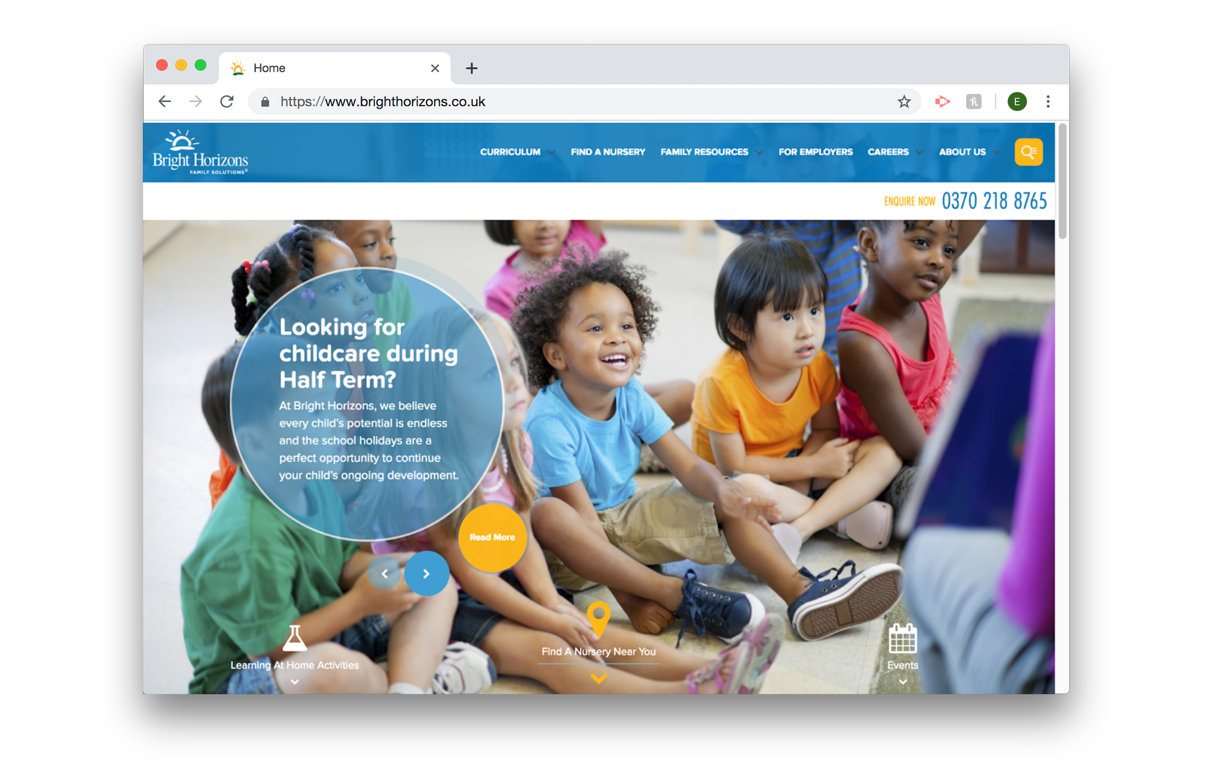
Bright Horizons
The last competitor we looked at was Bright Horizons. In my opinion this is the best of the competitors. A very visually appealing website, professional look but still reflects a children’s nursery. The full-size image draws the user in and having a slide show is a nice way of displaying more pictures. The bubbles and splats are good for small amounts of information. They also have an enquire now bar at the top, something our client suggested.
Some member of the group did say that the website did have a corporate feel to it, Our client wanted to communicate their friendliness on their website. Unlike the previous competitors there no find your nursery at the top. It is further down and has a larger section.
As you get further down the page, it gets very text heavy and you end up scrolling too much. This is the same for the mobile version, the user will then get bored.
Things we want to take from this competitor are:
-A professional appearance
-Modern feel
-Animations appearing as you scroll down the homepage
-Easy navigation
-Texts used in small amounts
Brief
The client wanted us to create a new website that has a modern look, is appealing to their demographic audience and also reflects their culture and ethos. Working as teams alongside developers we needed to research competitors, update branding and design and create a new website with an online database.