Development For Silk Mill Project
In order to refine our ideas for the project, it is important to see the information we are going to be working with and the supporting graphics for the content. As promised the client gave us some further reading on the information they wanted to include in the final outcome. This is a document with different aspects of the history, it’s very full on, but as it is key information we need to whittle out the key information for the audience.
The information we were sent is available on Steph's website.
History Notes
Whitchurch Silk Mill Report
Key points from the information given include “The journey of the silk used by the Mill, it is always a subject that is discussed by visitors at the Mill - possibly because of the enormity of the distance the silk has travelled, the many hands it has been through to get to Whitchurch and the multi-cultural elements to its journey” and “The Mill would like to capture this history of the ancient trade route in infographic form or digitally through animation”
Timeline Inspiration
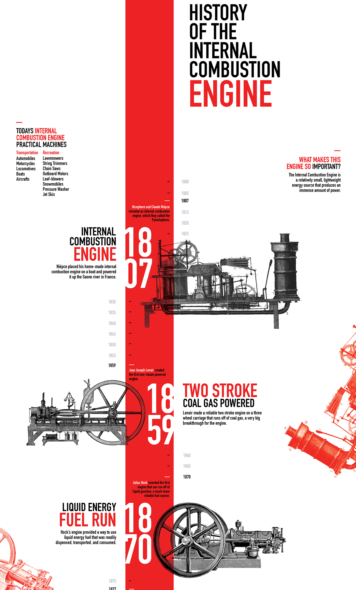
This infographic stands out due to the strong contrast of colours making it very eye catching. Mixing the old style sketches of engines with the modern type and a bright red line down the middle of the design successfully brings the old history into the modern time and is also visually attractive; making viewers more likely to read the information. Taking inspiration from this design, this would work with the Silk Mill, the building and the machinery is old and it’s been used the same way since 1817. Their refurbishment is to modernise the Mill and its brad while still showing the history through it.
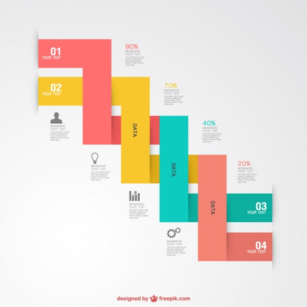
This is an infographic template, the idea is displaying 2 different timelines which is what we are after. It works for adding the modern features of the Mill, and we can always add the old style drawings like in the infographic above. It’s effective in that sense but the colours make it slightly confusing and makes the timeline confusing to follow. Then adding any data could make it overcrowded. So overall with the type of information we want to have and be shown in a way that is easy to follow for all ages.
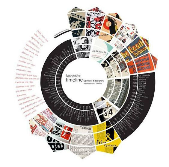
Circle infographics create a great visual statement, your eyeline follows round exploring all the data. The bigger image grabs the attention so you know where to start. We could adapt this so as you hover over a section more information pops up or the shape gets bigger so you can see it better. The issue would be that these would be extremely difficult to code, as Steph and I only have a basic understanding of coding it would take a lot longer to create this.
Timeline Mockup
Based on the timelines above we decided on taking inspiration from the Combustion engine timeline, with the solid colour line and adding images of the machinery from the Mill. Steph put these 2 mock ups together; one for this history timeline, making the purple timeline look like it's coming from the Mill, adding dates and pictures of important people. And another one for the production of silk, where the purple comes from the machine as if it’s being threaded. Although this is very basic it will be a good way to show the production process and this history in this style.
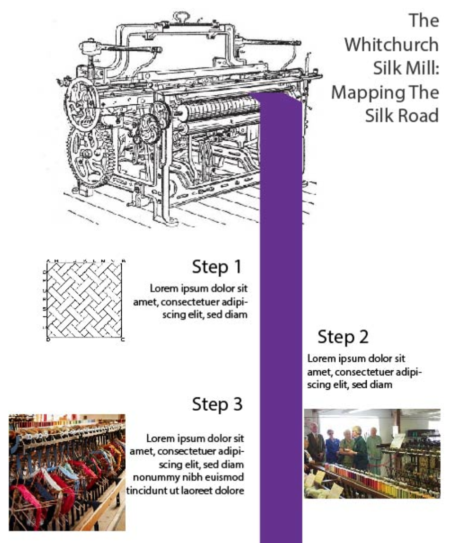
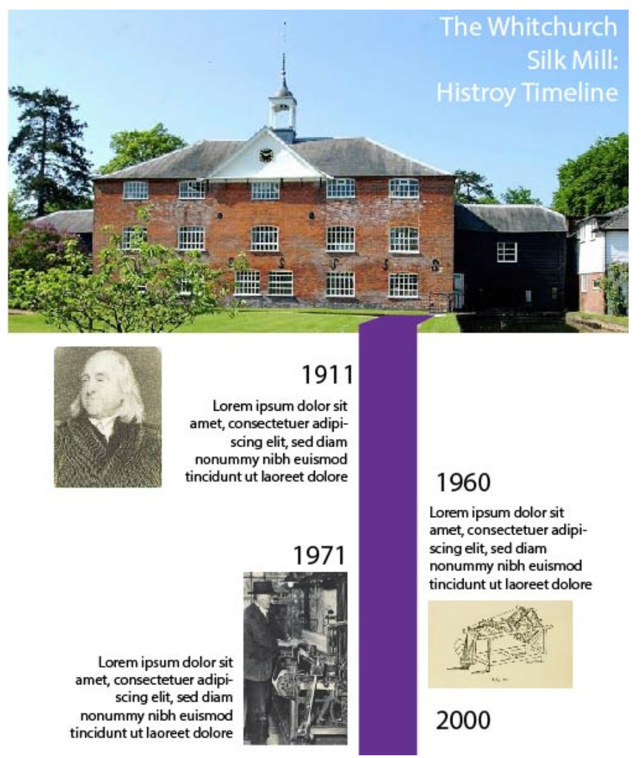
To continue brand identity we’ve used a rich purple which ties in with their brand, it also symbolises luxury and regal. To improve we want to change the pictures, perhaps even illustrate any imagery we need to include. We then need to look at making this interactive. Using HTML, adding animations and how to smoothly show both timelines. Going back to our initial ideas, using a clickthrough, but instead of different pages, it gives the idea it's scrolling through the timeline.
An idea of how we want ours to work is this History of Computers. We are drawing further inspiration from this timeline but there are some bugs we want to avoid. For each page, you have to scroll multiple times to get all the information to show or for the animation to start, although it’s a smooth process it is quite time consuming, sometimes the text appears and isn’t at full opacity making it hard to read, you can’t continue scrolling until any animations are finished.
Reflection on our Idea
Problems we could possibly face include:
- Coding a HTML infographic, as we are both designers our knowledge on development is limited and learnt through tutorials. This is time consuming and possibly means not having enough time to fix any issues we may face.
- Creating a HTML design that can be integrated to the Silk Mill's existing website, we don’t have access to the website so its need to be useable to those who will take over to add it to the website.
- The client wants the infographic available on their website as well as an interactive station throughout the mill. We need to make it responsive to work on other devices.
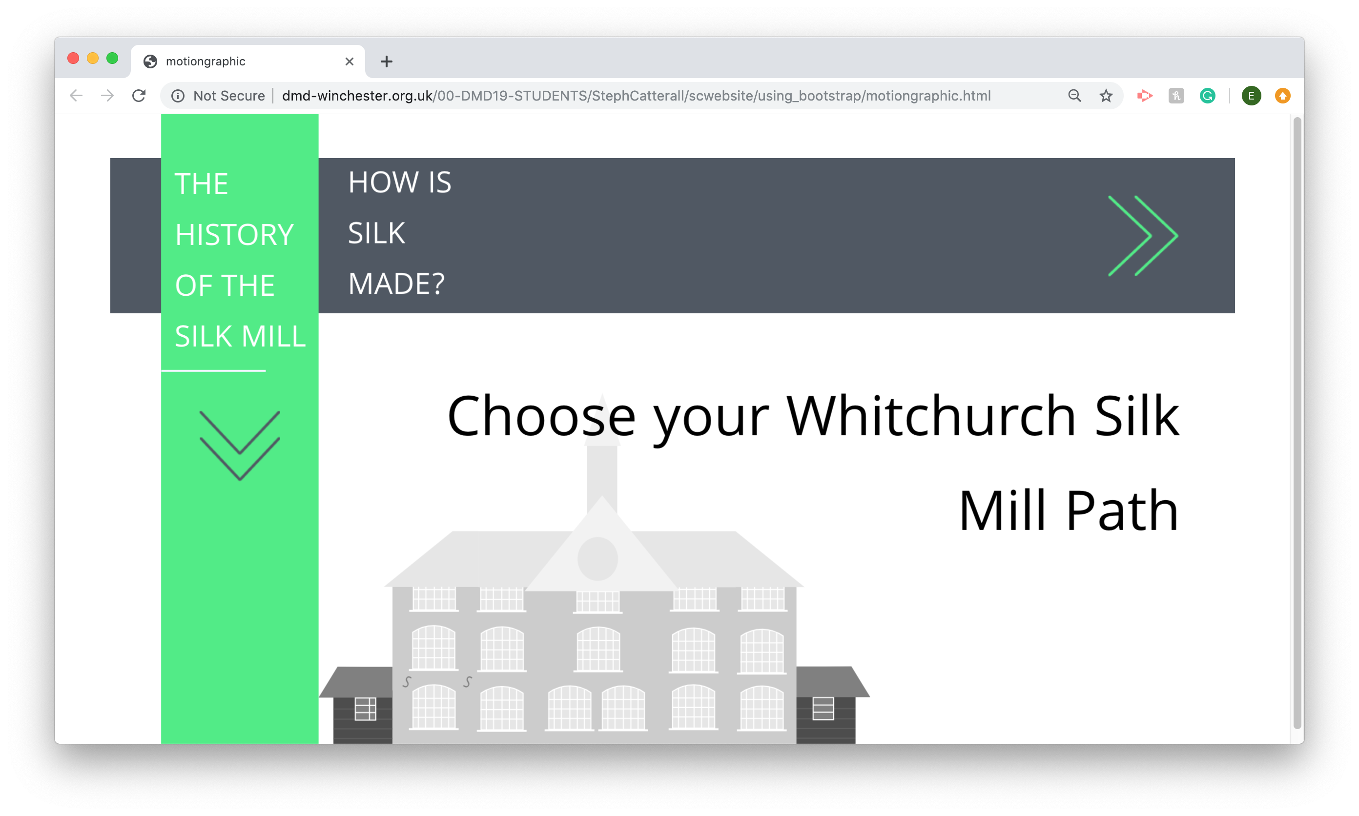
Final Idea
This is our first outcome that we sent to the client for feedback.
We used flat design to create a simple and minimalistic approach while still appealing to a wide audience. Our design uses illustrations, this is because there was not a lot of imagery that we could access and it was important to us that the graphics all had a similar look to them. When designing parts of the history steps it was difficult to create historically accurate illustrations as there were no photographs to work off, for example when illustrating people we don’t know what they looked like so we had to generalise.
For the design plan overall, I feel as though some of the designs need some further development and we could refine the outcome but we have produced a solid starting point for our infographic. This design allows us to create clear usability and clearly set out information supported by images, this makes interaction with the design really simple but still entices the user to find out more.
Feedback
The client was very happy with our outcome and only had a few comments for improvement.
- Add back buttons on the end page instead of having to start the process again.
- Change the plane pictures to a map, they would not have started using planes for transport.
We felt the points raised were valid, and would improve the infographic so we implemented the changes to finalise the project.
This project would have been very different if it wasn’t for Steph finding the software we used. It meant the infographic is completely responsive and can be used and displayed on their website, desktop, tablet and mobile. We started to get an understanding of what the Mill was like with the information we had, we thought about what information visitors would be interested in and discussed regular questions that were asked in the Mill.
To improve we would have liked to have more animations and more interactive aspects but due to the time frame we felt it was more important to have and end result to show the client, we had already discussed animations would be something we looked after we were happy with the product if time allowed. After finishing we’ve also thought it could be improved by adding sound, meaning young children who can’t read, people who struggle to read or those who are blind can still get something out of the infographic.
Despite there being room for improvement we are very happy with our outcome, we think it works really well and the client is very happy with it. We now need to create a new version so it can be printed and displayed around the mill.
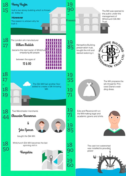
Printed Outcome
Brief
Our client, Whitchurch Silk Mill, have requested we bespeak the journey the Silk Mill has taken, this will be used to to inform visitors to either the website or the mill. The client has communicated an infographic format to explain the history of the ancient network of trade and routes that transported the silk, the format will also need to be compatible with desktop and mobile.
Here is our final infographic.
This is our printed version to be displayed or given out at the Mill.