Research For Silk Mill Project
Brief
Our client, Whitchurch Silk Mill, have requested we bespeak the journey the Silk Mill has taken; this will be used to inform visitors to either the website or the mill. The client has communicated an infographic format to explain the history of the ancient network of trade and routes that transported the silk; the format will also need to be compatible with desktop and mobile.
Objectives
- Create a design that is interactive and informative for the viewer.
- Find a digital platform able to create an interactive design that will work on multiple devices.
- Ensure the design contains the key information, without being overloading for the audience.
- Enhance the audience’s experience.
- Meet the brief of a client’s specifications.
Outcomes
- Produce ideas and the development of them with further research.
- Produce a final piece that is a suitable file size in order to reduce loading time.
- Ensure the design contains the key information, without being overloading for the audience.
- Produce either a working final piece or proof of concept, to present to the client.
- Create supporting infographic prints that can be put on display in the Silk Mill.
- To gain a better understanding of alternative ways to create interactive information.
Target Audience
When the client came in to further explain the brief they spoke about the audiences they wish to appeal to, these are as follows; Local families, Adults, Children, Young People/Students, Groups, Textile groups, People that are interested in the process, Social Hub, People that enjoy walks in country spaces and people that enjoy cafe visits.
Persona 1 - Natasha Spencer
 Natasha is in her mid-thirties, she is married and has a daughter who is 3 years old. Natasha and her husband believe it is important for their daughter to be learning about the world and its history so she grows up with a broad knowledge base. Their daughter loves to play outside with her dad so the family like to visit places that have outdoor space they can explore and play in. Natasha works part-time as a therapist, when she is at home, she often revisits places they enjoyed with her daughter while her husband is at work. She is also keen to continue her daughters learning at home, so having information that captures children's attention available from home would be an ideal way to continue the family’s enjoyment of their experience.
Persona 2 - Katie Andrews
 Katie is in her twenties and is currently at University doing a Masters Degree in Fashion and Textiles Design. It is important for her to have a basic knowledge of fabrics for her course, but she is also very interested in the history of fabrics and enjoys expanding her knowledge in this area. Katie likes to visit places of interest that have links to textiles and fashion as she finds them enjoyable days out and they provide her with inspiration. Katie also has a YouTube account with a high following, she posts vlogs and opinions as well as makeup and fashion tutorials, she also works with a wide range of brands to help promote them.
Persona 3 - David Ibbotson
 David is in his late sixties and he lives with his wife Louisa, both David and Louisa are retired but like to keep themselves busy. They both enjoy exploring new places, walking and bird watching however, they need the places they visit to have somewhere they can sit and rest during the day. David is very interested in history and is always looking to broaden his knowledge, he and his wife both love art and often visit art museums together. Once the couple find a place they enjoy, they tend to go back and visit on a regular basis.
Inspiration
I wanted to start this project by building an understanding of how infographics are created and what formats they can be displayed in, this will then help with the development of our initial ideas. I started this research process by looking at HTML infographics to figure out whether this could be something we could create.
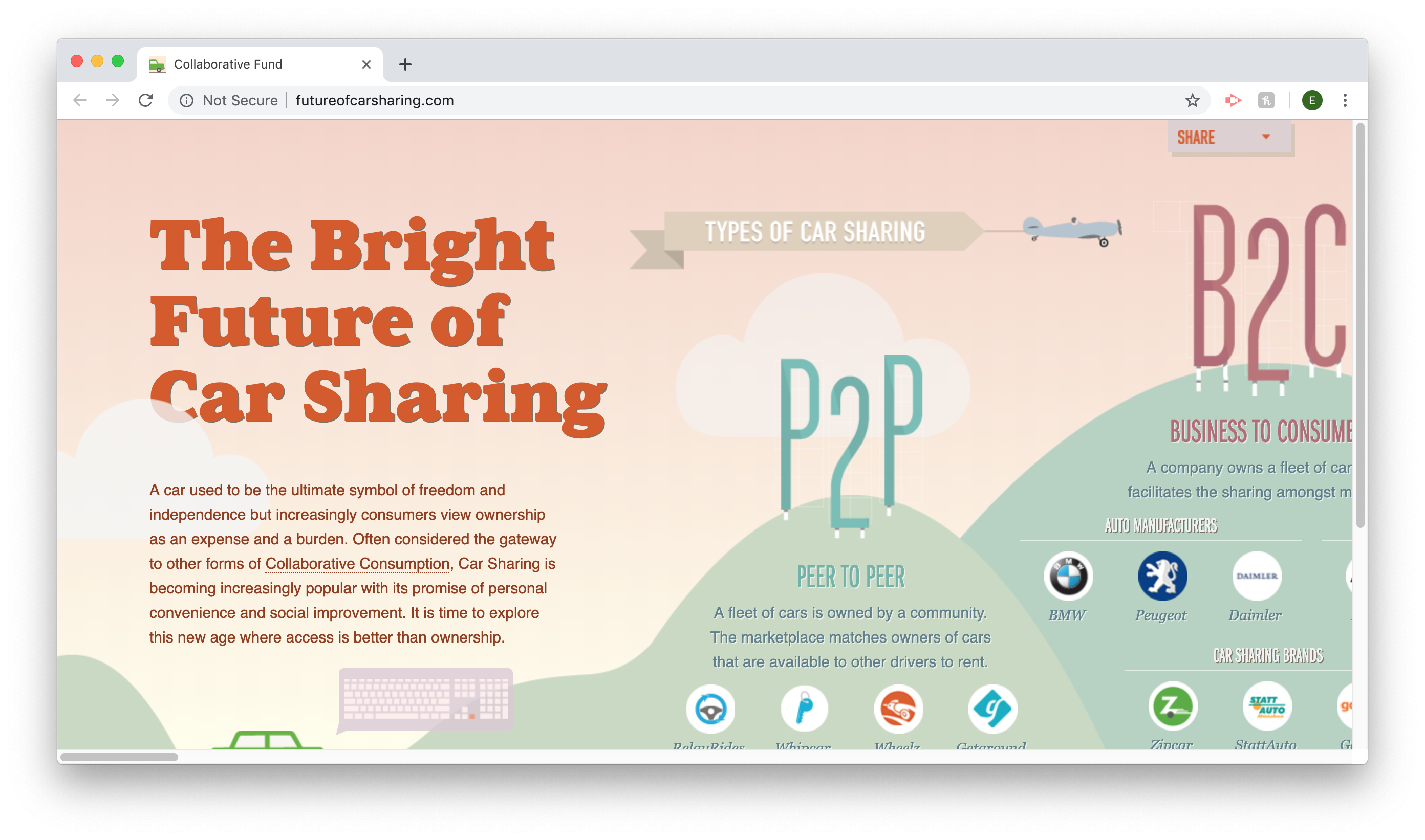
The Bright Future of Car Sharing
The above screenshots from the HTML side scrolling website give a brief display of how the website works and key aspects of the design. The infographic works by either side scrolling on your keypad, using the arrow keys on your keyboard or using touchscreen on a smart device. This example shows the infographics compatibility with a range of device and the fluidity of moving from devices without issues.
When you move across the screen the car moves with you, most of the time the car is visible, but there are times where the car goes behind design elements. When you pass them some of the design elements animate, I think this is highly effective as only a select few graphics do this meaning it isn’t overbearing of the overall design and doesn’t distract the viewer from the key information. The infographic has an element of realism as design elements that would naturally move in the wind, such as banners and flags, are animated to make them appear like they are moving in the wind.
One negative aspect of the infographic is the animated gorilla moving his arm. This is because there is a pop up for a video that only appears when you click on the gorilla, but it is not made clear that you need to click on him. I think this needs to be made clearer as it is easy to miss the video.
As a whole I think this infographic is really effective and is not over complicated, it contains enough information to inform the viewer without filling the page with text. The abundance of graphics supporting the information helps create points of interest for the viewer throughout the design and breaks up the text. We will take inspiration from this infographic on how we will display our information.
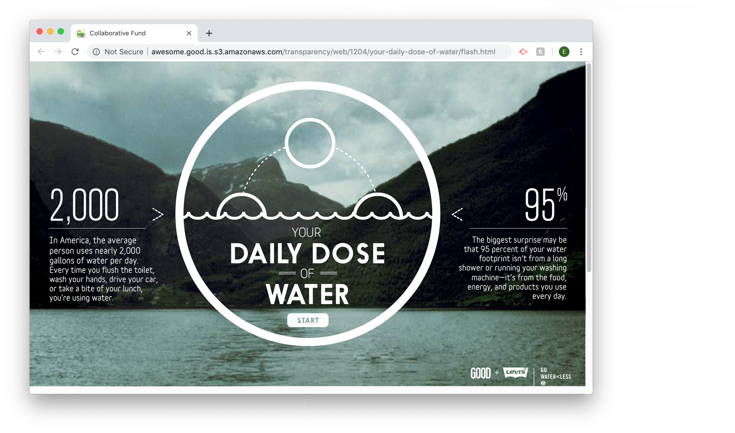
This infographic differs from the first one as it is not one page scrolling, instead, you are shown information in the space and are then taken to a new slide. This idea works really well for the topic of showing how much water you use in a day, as it helps convey the sense of a journey. The design is clear and straightforward, making it easy to understand. When I tried to view this infographic on a mobile device it stated that I needed Adobe Flash in order to view it. I inspected the code and the infographic was added like this, which makes me think it is not made with HTML.
< param name="movie" value="swf/GoodWater_loader.swf" >
As a whole I think this infographic is really effective and is not over complicated, it contains enough information to inform the viewer without filling the page with text. The abundance of graphics supporting the information helps create points of interest for the viewer throughout the design and breaks up the text. We will take inspiration from this infographic on how we will display our information.
Branding Awareness
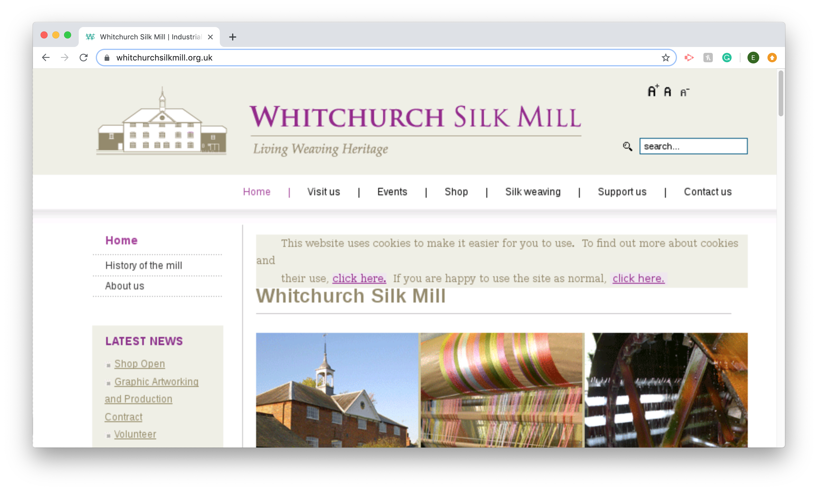
In order to keep consistency when creating a design for a client that already has an existing brand, it is extremely important that you carry on using the brand identity. This can be done by using a colour scheme that fits in and is already recognised by viewers. This is the current website for the Silk Mill but they are undergoing a renovation, in their building and digitally. The client isn’t entirely sure of all aspects of their branding guidelines. So giving colours and fonts that could possibly be changed could be risky. So another way this can be done is by using a style that already exists as part of the brand, for example as part of their heading the Silk Mill have a very simple flat design of the building. This idea could then be developed by adding aspects that fit the criteria of the brief. Although these are vital aspects to bear in mind, the Silk Mill is undergoing refurbishment so it is important that we also convey the idea that they are moving forward but still resemble the brand within our technology and designs.
Legal and Copyright Issues
We need to consider the copyright issues of using images of the Silk Mill found on the internet, if we do find any we wish to use we will have to explain to the owner why we are using them and ensure we ask for their permission to use them. Another possible legal issue may arise from fonts, we will need to make sure we are using fonts that have a commercial license.